 Step
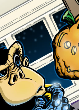
8: Finishing Touches
Now I decide to throw a little color onto my black linework. With the inked artwork layer selected, I click the "lock" option on the layers palette. Then, I brush in color. The windows become a dark blue gradient. The window pane borders become gray. Little details in the monkey's glove are blue, since it's glowing. Just a bit of tone here and there to bump up the lighting in certain areas. Mostly, I use this technique to add "aerial (or atmospheric) perspective". (An art term that says, bascially, objects become lighter and cooler and grayer... mistier... as they move away from you in space.)
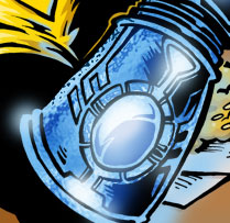
 I decided to get fancy with Chip's glove. Putting his glove color on its
own layer, I went to town with the dodge and burn tools. After that, I
applied an "ocean ripple" filter to it.
Finally, it was time for some highlights on the glove and bottle and pumpkin and stars. No big trick , really. Just airbrushed white spots here and there on a new layer above the inked artwork.
I should probably point out that I didn't stick to this order at all times. Sometimes I'd bop back and forth between shading and ink-coloring and glove highlights and what-all. But, the trick, I think, is to leave yourself with enough elbow room to make big changes quickly if something isn't working.
Also, I have no idea how the pros color their artwork. I've been told they use Adobe Illustrator and Photoshop together, bezier paths, Wacom tablets, and the whole 9, but you'll have to ask them.
*Note: for those die-hard photoshop fans, I've provided a screenshot of the layers palette of the final piece of artwork to show you what I've been talking about. Click here to view.